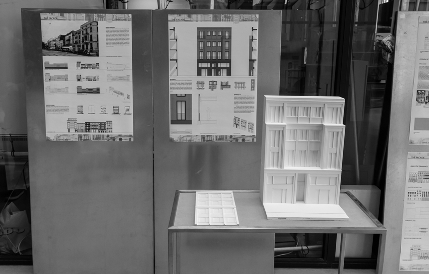
Facade Frankrijklei 131
[Design] Belgium | Antwerp
2014
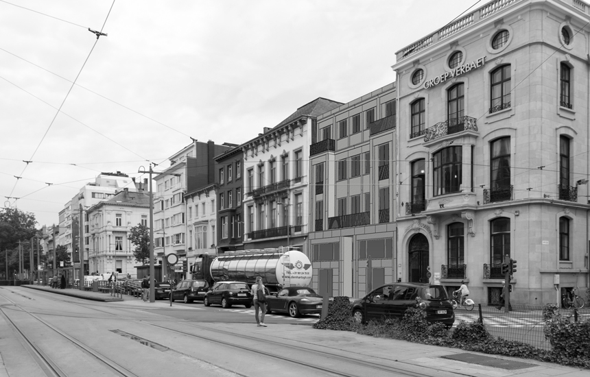
The façade of an Antwerp row house is subject of the design task. The challenge is to find a balance between the autonomy of the architectural expression and the integrative capability regarding the urban context, in other words: the common architectural order and the specificity of place. Starting point of the design is the analysis of the spatial and architectural conditions of the urban context in order to be able to find and to relate to the existing order of the location. The location is a vacant lot at Frankrijklei, between Maria-Henriettalei and Lange Leemstraat. The height of the façade has to be “in harmony” with the adjoining buildings (according to the Antwerp “harmonieregel”) and addressing the representative character of the street.
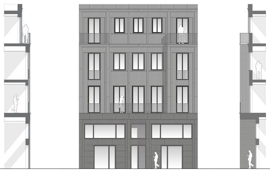
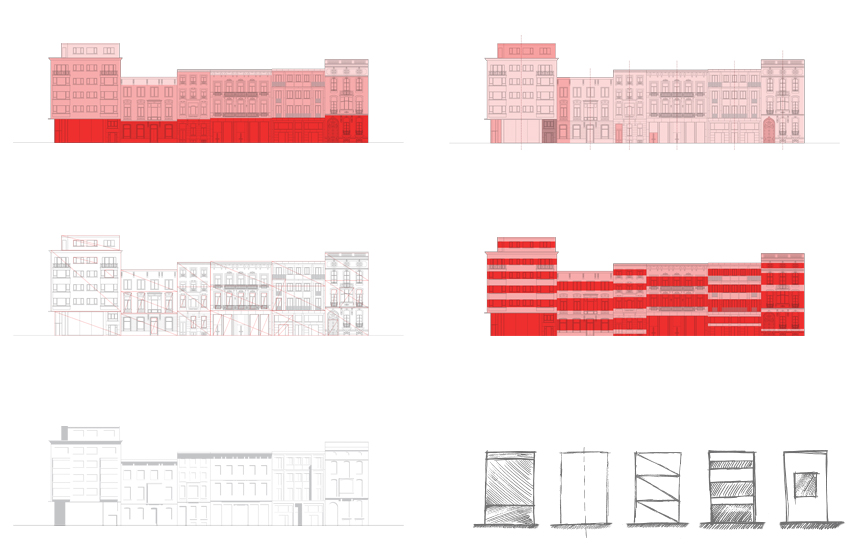
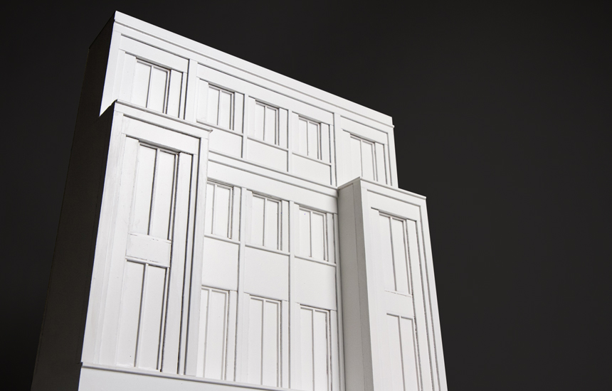
There are five analyses which are the most important for defining the “rules” of the façade design. The analyses have been selected because of their importance for the street character. The façade design should have a three partition - plinth, middle and top section (1); symmetry (2); a plinth proportion which defines the height (3); decreasing horizontal height (4), and a exceptional feature in the facade (5)
Before the façade design in Antwerp, Hofgarten am Gendarmenmarkt - Hans Kollhoff has been analysed. By analysing Hans Kollhoff’s façade designs, an architectural theme has been chosen to introduce into the façade design. The theme - façade relief - has been analysed in the urban context and has been tested within the façade design by making many sketches. These sketches have led to an architectural relief identity which participates in the urban context.
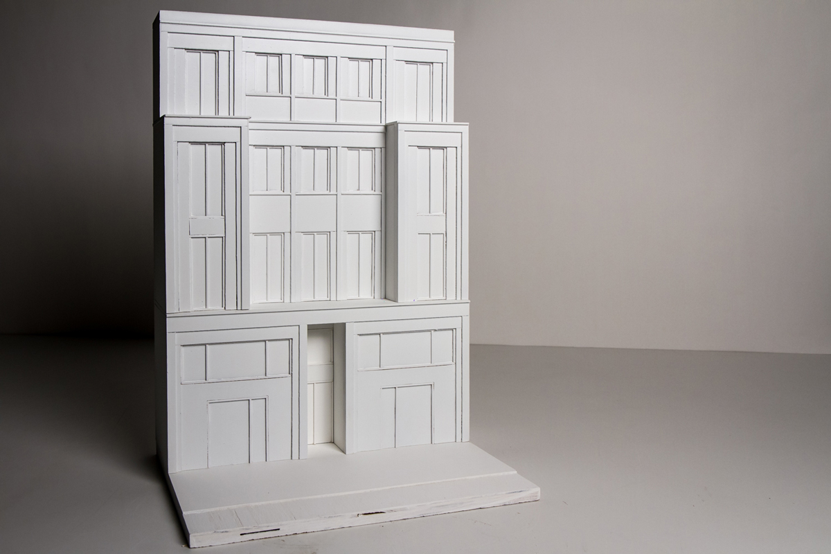
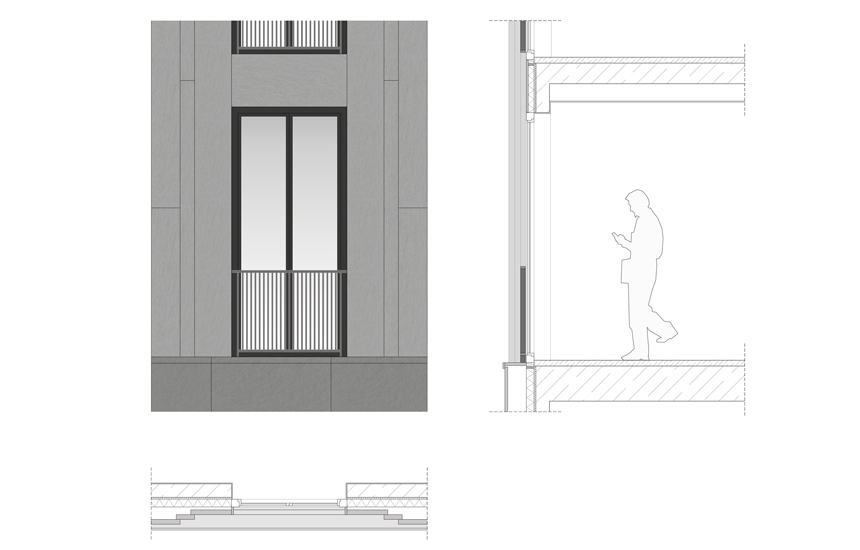
The ground floor forms a monolithic plinth zone with large windows in black aluminium profiles. They relate with axial symmetry to the entrance which is hollowed out of the main volume. The walls, shafts and cornices of the remaining storeys are arranged on the plinth and reflect the structural system of the building. The windows on the second and third floor of the middle section have a slightly larger width to create an exception in the façade. The facade is created with patterned gray granite which creates a subtle relief. The plinth is realised in a slightly darker gray granite to define the three partition. To create the impression of a solid building with a jointed facade, the slabs overlap without obvious joints.